Main Gallery
Angela Mia
Description
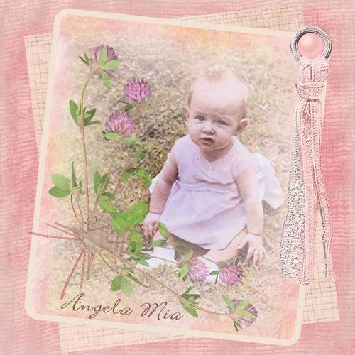
This is a photo of my daughter that was taken in 1960. It has been very difficult to work with because it is faded and the grass in the background looks brown and grungy.
To tint it, I used a piece of BG paper that has pink around the outside and a soft yellow in the middle. It softened the picture and added some color to the grassy area. I added some color to her face and dress using colored shapes and reducing the opacity. I also added a tiny white dot to her eyes and reduced the opacity to 30. The title is from a song I used to sing to her.
BeachScraper,
at 03:53PM on Wednesday October 01, 2008
Excellent job, that was a great idea to add the original photo. This turned out beautiful. Adding the flowers was the perfect touch. OUTSTANDING!
Montana,
at 06:26PM on Wednesday October 01, 2008
Very nice. I love the overall vintage feel of this LO. I like seeing the original, also, it gives us a reference for what you actually did and how well the tinting worked. Beautiful!
Jesse77,
at 10:01AM on Friday October 03, 2008
FANTASTIC!!!!! so soft and pretty, its just perfect :)
RABIDFOX,
at 02:58PM on Friday October 03, 2008
This is really really pretty. I must admit, I AM jealous! I can't believe just how different you made the original look.
audosborne,
at 01:08PM on Saturday October 04, 2008
Thanks for all you kind comments.
Jesse77,
at 10:59AM on Tuesday October 07, 2008
Congrats Ruth, on winning the challenge! What did you win?
audosborne,
at 11:48AM on Tuesday October 07, 2008
Thanks Jesse! I was surprised because there were some other LOs I liked better. I won the new Fall Kit by Daniella Englebertsrom. I don't know if I spelled her name right:)
brendasuedouglas,
at 07:03AM on Saturday October 11, 2008
This is very subtle and beautiful! Wow! I have only boys, so I especially love the girly things and this is particularly impressive.
Donna Jean,
at 03:16PM on Tuesday October 14, 2008
Hi, so very precious. How did you tint the color of the picture? You said you tinted it with paper that was soft yellow in the middle? Can we layer things and reduce the saturaration or make it transparent? I'm new to this so I 'm not sure how you did that, but I sure am impressed if you did it the way I think you did! Thanks!
audosborne,
at 02:49PM on Wednesday October 15, 2008
Yes Donna, I just reduced the opacity..at least I think that's what I did. I will never be able to duplicate this LO. It was all trial and error. But, we can reduce the saturation by using the opacity tool..great tool!!
Donna Jean,
at 04:01AM on Saturday November 01, 2008
Thanks for responding! I can't wait to try this out for myself. I really didn't know it was possible. I look forward to seeing more of your work. The gallery is very inspiring!


Comments